08/06/2010


Complete Sample Book


29/05/2010

Print Ready


After running through the complex layout with various prints and papers with the printers and adjusting bleed and vital crop marks, the book is print ready with Hobs reprographics and I have instructed them of where the samples go, and when the tabs and inserts are to be cut to get the staggered layout that is essential to an effective layout.

The book is a matt finish hardback image wrap cover, with 12 real scale print samples and 8 text and photographic pages to accompany including in situ images, reference to dissertation and theory, thermochromic print information and photography and collection overview.

After three hours of meticulous explanation and mock ups, the book is print ready as of Wednesday and should be ready for next Tuesday 1st June.


28/05/2010

Print Sample Range

Fig. 1 shows samples of each design range in all three colour ways.
These will feature in the full colour hard back sample book as separately printed inserts.

Fig. 1


Title Design


The front cover and identity for the collection. Typography constructed from samples of each print design in the collection.


Finished Thermochromic Wallpaper


To accompany the collection and sample book, and to show an example of a full scale representation of the collection (fig. 2), I have screen printed by hand an edition of the Neo Mod range in colour 'CYK' with an interactive thermochromic feature (fig.1).


Fig. 1
Fig. 2

Test Prints for Book Inserts


This is a test to see how the layers of print sit staggered on top of each other, as a rough mock up to give to the printers as reference for when they bind the sample book.

25/05/2010

Collection Developments & Sample Book Layout

The collection is comprised of four ranges consisting of three colour ways in each range.
I have taken this into consideration when planning the layout for the sample book, size, thickness etc.

From researching various wallpaper sample books, and as my collection is a concise one, I have decided not to go for a interchangeable folder-like book that the samples can be taken out of and changed for practicality, but a more definite perfect bound book. The samples are secure in the book, but printed on a 160 gsm cartridge paper and inter-sectioned with the 100 gsm silk which will feature text and photography.

20/05/2010

Pellafort Press - Thermochromic Wallpaper Printing

Preparation & Testing


I arrived at 9am at Pellafort Press and met with Scarlett Massel, owner of the press to discuss the plan of action. I decided to go over each design layer again, and perfect the layout then put each design layer into grayscale Colour Halftone format to prepare the image for screen. We then used the A1 printer to print each scale black and white image and exposed them onto each emulsion covered screen in the exposure unit.


After doing this for each screen, the emulsion was power washed off and I then spot filled with more emulsion to avoid spotting on the paper. The screens were then hardened off in the exposure unit again. We did a test screen with a piece of each design first to test the quality of the print, and adjusted the designs contrast on the laptop before we began the final peice.


The Screens & The Press

After the screens had all been exposed, spot filled and hardened off, they were ready for printing. To prepare the ink for printing, I mixed up the pure water based ink with the acrylic binder and did this for the blackk test ink, the yellow and blue inks, and later the thermochromic ink.


The first layer is the lightest ink - yellow, so the screen was fixed into the frame over the print bed and the paper laid out in the correct position. Then I printed onto acetate for registration and then began to print from one end of the paper and pulled it down to continue the next part of the print. I did this for four strips of paper measuring 53cm wide x 300cm long.


Building Print Layers

After the yellow layer was complete and sufficiently dried on the rack, I began the process again with the next layer of pattern, the blue design. After overlaying the blue layer and allowing to dry, I prepared the thermochromic ink by mixing the 31 degrees black slurry with the water based binder, and added 10% water to thin it out a little to make it easier to pass through the screen.


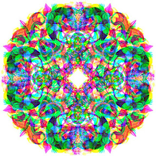
This is where I am at the moment, the last layer is printed but takes longer to dry so I have left it at the Press to dry completely and I will be picking it up tomorrow providing it is sufficiently dry.

13/05/2010

Close up Reveal Panel

Full Length Visualisation of Print


Top layer (Fig.1) and Reveal layer (Fig.2)

Fig. 1


Fig. 2


Screen Size to Scale

This is a scale example of what will be exposed onto one screen and repeat printed. The example shown below is only the top layer, but the same size and layout will apply to the other two layers also. Click below for scale image.


Design Progression - Rethinking Colour and Form


After considering and assessing my previous design using three colours, I have decided to simplify the design by using a black and white top aesthetic, with the coloured layers concealed beneath, making the appearance of colour when heated, even more pleasing.

I have also decided to rearrange the layers of imagery so that the underneath layers are perfectly concealed before touch is applied, but under the images as opposed to under the entire top layer, so there will be more white space, indicating where to touch - your eye is drawn to the image (which is roughly the size of your hand) so that is unveiled first as opposed to moving your hands everywhere to find the underlying full image.

This is the new tile, which will be part of a repeat pattern, shown in all layers and as a multiplied image that shows how all layers fit over each other.

12/05/2010

Printing Plans at Pellafort Press


I will be screen printing (with some professional assistance) the wallpaper in layers (2 in regular ink and the top layer in thermochromic ink) at the Pellafort Press in Brixton on the 19th and 20th of May. I have booked the studio for two whole days from 9am - 5pm to leave time for test prints, and any corrections, to achieve the highest quality outcome. I am printing it myself as opposed to sending it off to be printed as I want have a level of control that assures my design is perfectly laid and to experiment with the thermochromic ink as I am bringing this in from an external supplier.

The aim is to screen print half a roll of wallpaper in order to provide enough for a panel as wide as 2 strips (approx 2 x 540mm) and reaches floor to ceiling (measurements to be confirmed), to simulate it in its intended state, with the sample book providing reference.

10/05/2010

Simulation of Interactivity


This simulated image shows how the print will respond to touch. When heat is applied, the top layer of image fades away to reveal the illustration underneath. When the ink cools it will reappear.


Printing with Interactive Inks - Custhom Mixed Media Design

Custhom Mixed Media Design collective consists of two RCA graduates that speacialise in digital, embroidery, screen print and illustration. They have also produced a thermochromic wallpaper of their own and this inspired me to call them, and quiz them.

Based on their experience, these are some of the pointers they gave me to aid my design and production process.

* For heat sensitive (such as radiators, water pipes etc) use 47 degree reactive inks,and for touch sensitive print use 31 degrees reactive ink.

* When putting up thermochromic wallpaper, be aware of the temperature of the surface you will hang it on, e.g, a brick wall is colder than wooden board, so use a lower temperature reactive ink for hanging on a colder surface.

* Use one thick layer of thermochromic ink over the original design to be revealed, as opposed to many thin layers for smoothest outcome - this should be dark enough to cover the under layer.

* Use a yellow-based hue for the original under layer design, as the thermochromic ink does not 100% disappear, it simply fades to clear, leaving a very faint yellowish colouring which may alter the colour of the under layer.

http://cheifnath.110mb.com/CUSTHOMSITE/wordpress/


Proposed Wallpaper Design - Layered

This is a visualisation of the final print design with all layers, fig. one illustrates how the layers have been arranged upon each other on the grid. (Note these will not all be visible when printed). Fig. 2 shows what the final design will look like printed and which layers will be visible.

Fig. One

Fig. Two


Layers of Print - Work in Progress

Each layer has been designed and laid out on the grid to fit perfectly, there will be alterations to come.


Thermochromic ink layer fitted into the layout grid.


Blue ink layer fitted into the layout grid.


Yellow ink layer fitted into the layout grid.


Thermochromic Wallpaper Grid Development

So the three layers (three colours) of ink, lie on the grid, each design fits perfectly inside the structure so that the correct parts of the layer to be revealed do so.


This is how the layers are made up:

Layer One (base layer) - Blue standard water based ink, non-reactive design goes on first by screen,
Layer Two - Yellow standard water based ink, also non-reactive design is printed on top of the base layer, of which no parts overlap.

This creates the hidden illustration to be revealed.

Layer Three (Thermochromic layer) - This top layer will be screen printed in a retro dark indigo heat reactive ink (31 degrees) which will cover the majority of the two other layers of print, with just samples of colour showing through.

The idea then is that when you rub the top layer or heat it, it will turn clear to reveal the narrative underneath, and as it starts to cool, the top layer returns.

Thermochromic Inks Ordered


After explaining the project to a rep at inks and printing specialist TMC Hallcrest, they have agreed to send me enough ink (in components for mixing) for printing my design in an appropriate range of temperatures (15, 31 and 47)
and colours ( black, red and blue).
All inks turn clear when heated at different temperatures.
Experimentation commences on Thursday..


http://www.chromazone.co.uk/Thermostar.htm

Grid construction


After researching wallpaper layout, technical drawing and composition, I have designed a grid that each layer/colour of print fits into. This grid comprises of three layers which are designed to fit each individual print layer and position these layers on top of each other perfectly.


05/05/2010

Final Design Outcomes


The Outcomes

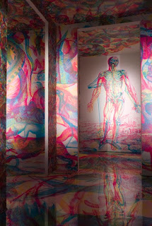
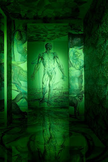
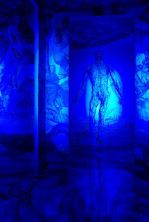
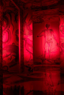
A collection of 6 interactive surface prints, realised in the form of graphic wallpaper, that reveal extended narrative and play with the original narrative, illustrating the fluidity of Urban Tribalism in postsubcultural society, with contrast to the fixed subcultural theory of past years.

&

One fully printed graphic wallpaper for installation that represents the collection.

&

A sample book that presents each design beautifully, with variable editions in context, featuring photography in situ, foreword and accompanying written commentary.


Production Notes


Design

Design of each surface print (each combining 3 layers of illustration) is underway, the first design is near completion, and two more are under construction.

A further three designs have been planned and researched, and will soon be ready for illustration.


Printing

The wallpaper will either be screen printed out of house, with the possibility of further overlaid printing by hand, or ideally hand silk screen printed for best possible quality (this depends on time restraints and design developments and considerations).


The sample book will be printed out of house, and then additional scale screen printed samples will be added according to time restraints and design requirements.


Problems

Potential problems cropping up so far are largely to do with the interactive ink i want to use to overlay the wallpaper print. It is becoming very hard to track down, and places able to print it are far and few between. As a result, this may have to be revised if it cannot be resolved in the near future as production begins in approx 2 weeks.


04/05/2010

Visualisation of Sample Book

Layout of Sample Book

Full Colour Wallpaper no. 03 B-boy Chic.

Urban Tribe no. 03// B-boy chic full colour

RGB Wallpaper : inspired by Carnovsky studio

Urban Tribe no. 03// B-boy chic RGB


RGB separated layers, each layer depicting an alternate narrative, which when viewed under a blue, green or red filter allows you to view each print individually.

28/04/2010

Carnovsky's RGB Wallpaper

For the Milan Design Week, Italian studio Carnovsky created a series of wallpapers that react to different coloured lights. The designs were created for the Milan shop of Janelli & Volpi, a noted Italian wallpaper brand. Each features overlapping illustrations, different elements of which are revealed depending on whether a blue, green or red light is shone upon them.